 Team Workload
for Microsoft Planner
Team Workload
for Microsoft Planner
Team Workload
for Microsoft Planner
Team Workload
for Microsoft Planner
For Microsoft Planner
Dashboards, overdue work and completion trends across every plan you can already see. No report to build, no flow to keep running, no dataset for someone to own when it breaks.
30-day free trial · no credit card · from $19/month for the whole organisation
The Dashboard rollup, the Overdue worklist banded by lateness, and the Trends curves — all of it spanning every plan, none of it built by you.
 1:13
1:13
73 seconds. The Dashboard opens it; Overdue is at 0:34 and Trends at 0:44.
Planner gives you each of these one plan at a time, if at all. These span everything you can open.
Status, priority, bucket and member breakdowns rolled up across all your plans at once. Planner's own Charts view gives you the same four breakdowns — but only ever inside one plan.
A ranked worklist banded by how late work actually is — 1–7 days, 8–30, and 30+. A flat date sort puts a task two days late next to one forty-four days late as if they were the same problem.
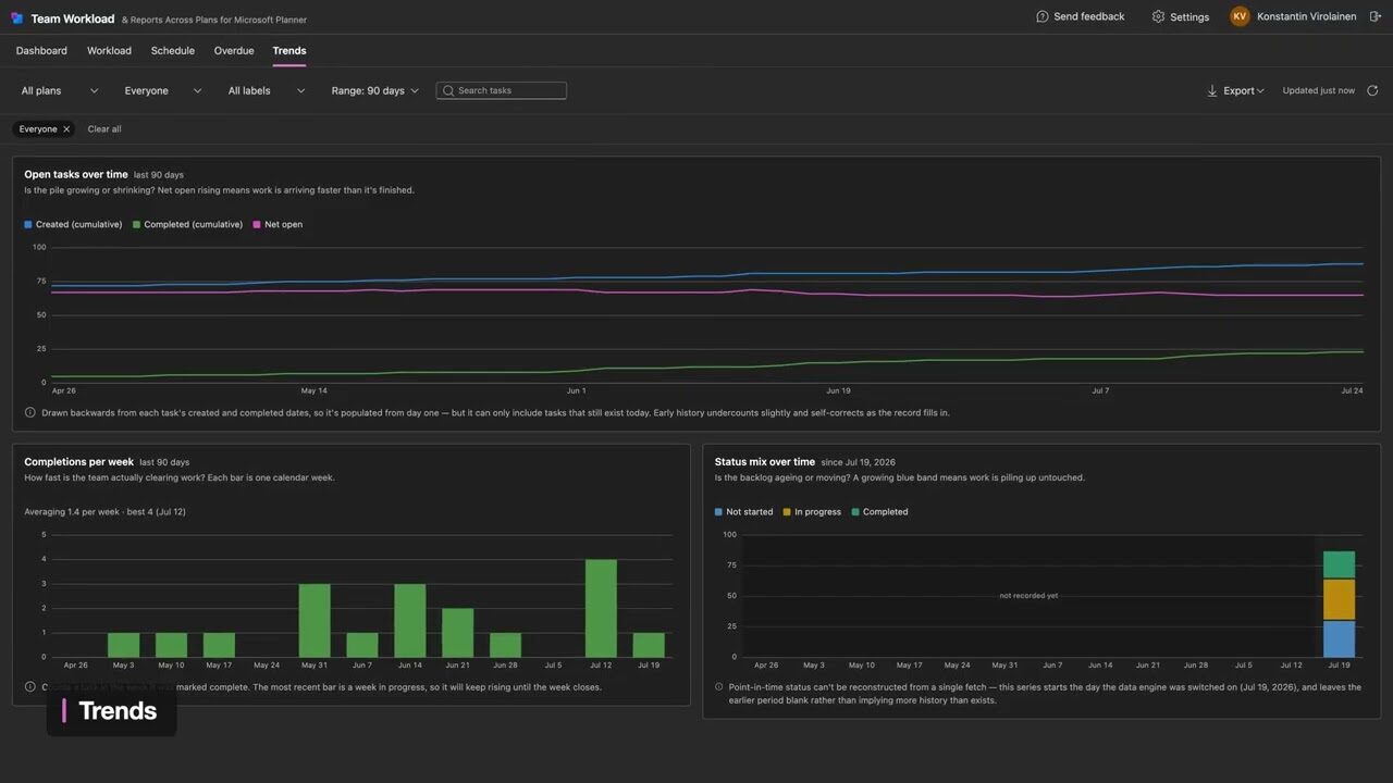
Completion and net-open curves over time. Planner keeps no history of its own — close a task and yesterday is gone — so we record a daily snapshot and the curve exists.
Every app ranking above us on planner reporting is a free Power BI template. That is a real option — here is what you are actually signing up for.
Pick a scope, then narrow by plan or label. Switch report and your scope follows you across.
Direct reports are read straight from your Microsoft 365 directory, so there is no team list to build or keep up to date. It reads one level — the people who report to you, not their reports in turn.
Every report exports to a single Excel file covering every plan in scope, and prints to a clean PDF whose header states which view it is, what it covers and when it was produced — so a report you hand to someone explains itself.
Not natively. Planner's Charts view breaks tasks down by status, priority, bucket and member — but only inside one plan at a time — and Portfolios rolls plans up by percent complete rather than showing the work underneath. To get one dashboard spanning every plan you either build the pipeline yourself over Microsoft Graph, or use a cross-plan tool. Team Workload reports across every plan you can already open.
No. Power BI is the common answer because it is the one Microsoft documents, but it is a build: a flow or script to get the data out, somewhere to keep it, a report on top, and Power BI Pro licences for the people who read it. If what you wanted was the report rather than the pipeline, you can skip all of it.
No — and this is worth being precise about, because it limits every reporting tool including this one. Planner stores a task's current state, not yesterday's, so nothing can reconstruct a trend line from Planner alone. Team Workload records its own daily snapshot from the day your organisation starts, and draws retroactive created and completed curves from the timestamps Planner does keep.
What no tool can give you is a history of the period before anyone was recording it.
Three honest limits. It cannot tell you how long a task sat in a given status — Microsoft Graph exposes no status-change timestamps, so that history does not exist to read. The direct-reports scope is one level deep, not the full org tree. And it only ever sees the plans you can already open in Planner, so it is not an organisation-wide audit tool.
Only the plans you already have access to in Microsoft Planner, read live through Microsoft Graph. It never creates, edits or deletes a task. Some Microsoft 365 organisations require a tenant admin to approve the app before anyone can sign in.
Longer, tool-agnostic write-ups of each problem, including the DIY routes.
Sign in with Microsoft and the reports are there. Thirty days free, no credit card.